Practical UX solutions with a measurable impact on m-commerce

 Blog
Blog
Share:
Projects carried out for our clients and observation of the market indicate a rapid increase in popularity of purchases made not only in e-commerce channels but also m-commerce.
82% of all internet users in the USA admit that they have used their mobile phone to make a purchase online. Slightly more than 30% of all online purchases are made on a smartphone, and conversions in mobile apps compared to “desktop” shops are three times higher. What could be the reason for this difference in conversions? There may be a number of factors, but an important one is a difference in the approach to designing mobile apps compared to RWD shops displayed on a mobile device or desktop. What principles should be applied to make browsing on mobile a positive experience and lead to a purchase? The following article will present a few principles that apply when creating m-commerce projects.
The “Accessibility of key features to the thumb” principle
Smartphones on the market are reaching ever larger sizes. Even people with very long fingers find it difficult to reach the top of the screen with their thumb when using the phone with one hand. Therefore, it is advisable to place all the most important functionalities at the bottom of the screen. The visualisation below shows places that are easy and difficult to reach with an average person’s thumb.
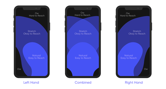
This graphic, in an almost unchanged form, has been known for 10 years. However, it is still popular to place the “hamburger” (colloquial name of the main menu, derived from the icon representing three horizontal lines, which resembles a sandwich) and search engines on the top bars of pages displayed on mobile. While apps are dominated by menus at the bottom of the screen, pages displayed in mobile browsers don’t necessarily stick to placing popular options within thumb’s reach.
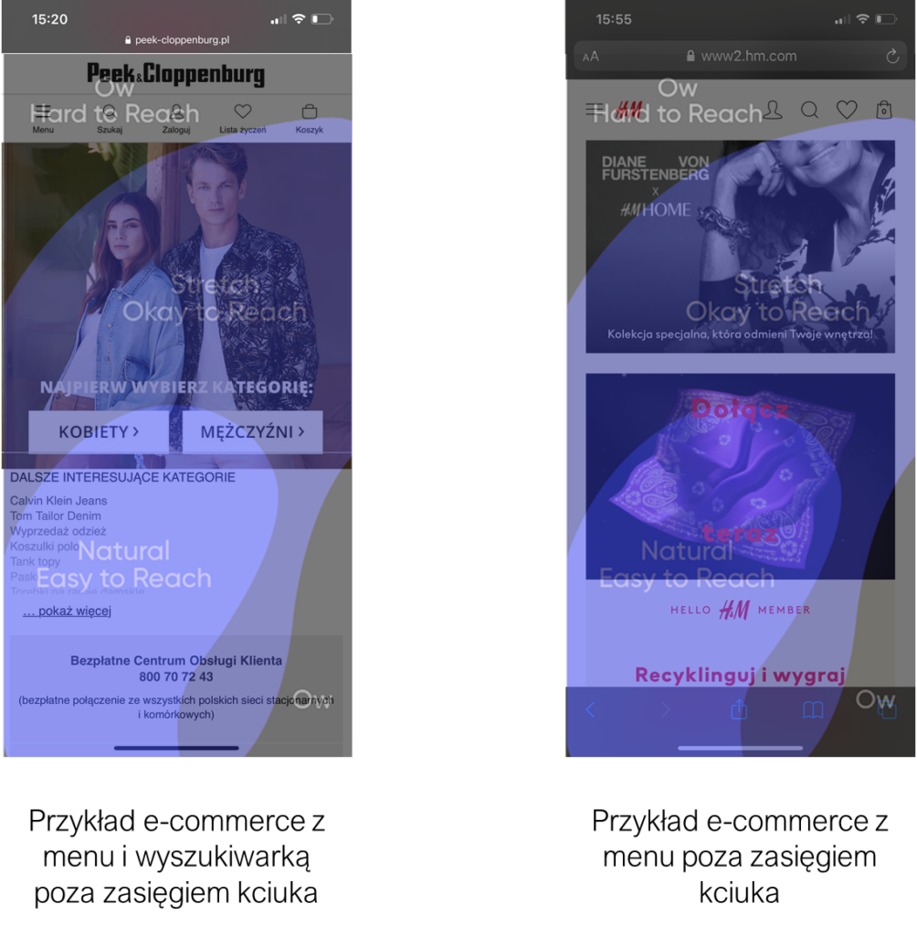
Quick research shows that even well-designed RWD shops do not shy away from placing options in places hard to reach with the thumb, marked in black:
However, there are some RWD website designs that draw on solutions specific to mobile apps, trying to make the main menu, category or search engine easy to access from the start of the process:
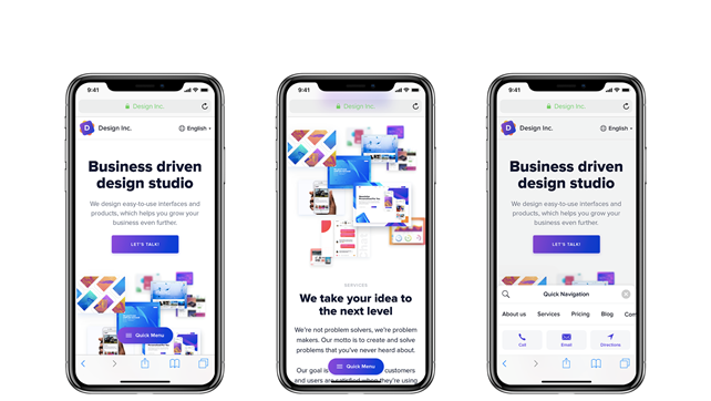
The use of a floating button (one that does not change its position when scrolling up or down the page) allows access to the menu at any time.
while on the page. When you expand the options, all the “tools” appear, allowing you to perform the desired action, such as searching for a phrase, displaying a contact, or using the menu. The entire slide-out panel is located in a place ideally accessible to the user’s thumb.
The principle of “accessibility of elements for the thumb” is extremely important in the context of understanding how the best product cards, search engines or filters are designed. This does not mean, however, that you should always focus on placing all available options in one place, at the bottom of the screen. It is worth making a selection of the most popular paths or the way users navigate the designed page and enable smooth and comfortable one-handed operation, without changing the position of the phone in the hand. In a project for one of our clients, following this principle, we placed product categories, a search engine and a shopping cart on the bottom bar, thanks to which it is possible to go to checkout in a flash:
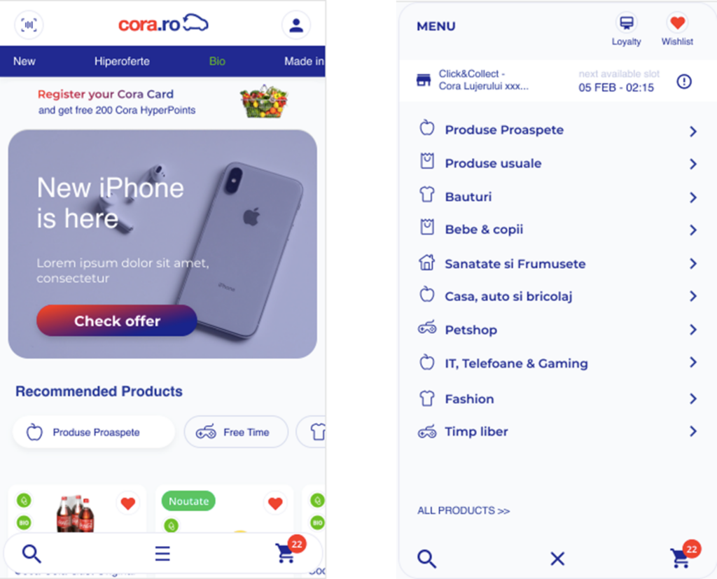
The bottom bar travels with the user while browsing the site, navigation is extremely intuitive, as is the transition to the finalisation of the purchase, via an easily accessible basket.
Less is more
This is a well-known principle in the world of design, but when it comes to mobile solutions it is all about focusing on showing the main, necessary and readable information. Scaling down or transferring information architecture from desktop versions of websites does not necessarily work on mobile versions. An example of this is showing the standard registration steps:
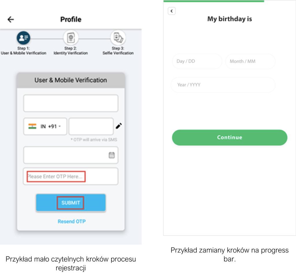
The second solution we prepared for one of our clients contains only a progress bar. We abandoned the textual presentation of the consecutive steps, focusing instead on illustrating the ongoing progress in the process. A wide CTA button “Continue” appears just above the keyboard, which will be displayed after activating the field for entering the day, month or year of the user’s birth.
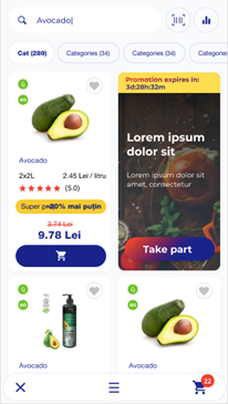
It is also important in the context of minimalism to focus on a single action performed by the user at that moment. This is a situation where the user searches for a product or uses filters – we can treat both subjects in full-screen mode, minimising the number of presented information and showing only the options connected with a given action. The example on the left, firstly, makes it impossible to apply filters without scrolling down the page (no “floating button”). We do not need the chat and the top bar.
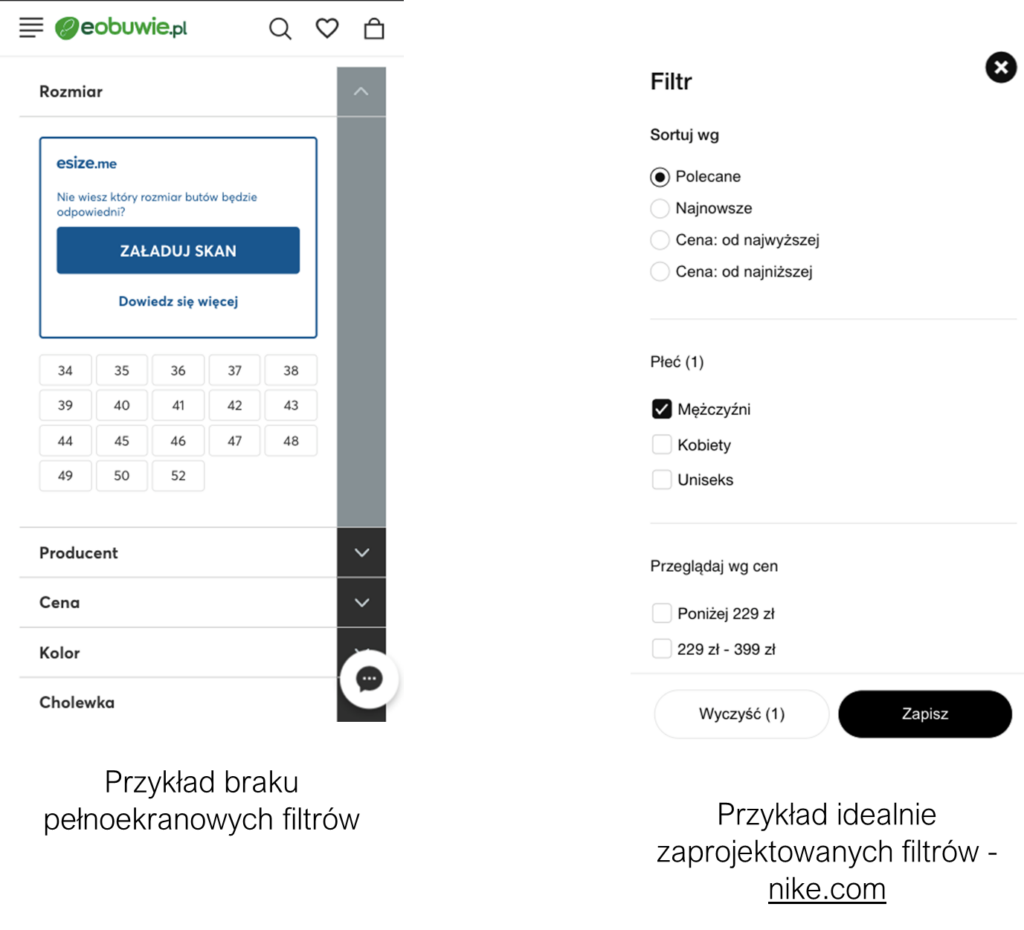
When using filters, the user is focused on one specific action, so we should limit the number of available options. The example on the right shows, however, well-designed filters – at any time we can display the results by clicking the floating “Save” button or clear the previously selected filters with one click. A similar approach should be used in the search engine – by displaying the results full-screen, we have many opportunities to increase conversions – for example, by being able to add products to the basket directly from the search results:
In the example above, that I designed, we focused on getting to the product as quickly as possible. After typing in a keyword and hiding the keyboard (clicking anywhere on the screen), we see a full-screen search engine showing products and a CTA button – “Add to basket”. After adding, the user can go directly from the search engine to the basket, visible at the bottom of the screen, and from there directly to the payment. This approach shortens the purchase path as much as possible from the moment of searching for a product to placing it in the basket.
Floating elements as a key element of information architecture
In earlier paragraphs, I mentioned the rationale for using floating elements and the benefits they can bring when placed appropriately. Of course, we guess that they should be in places that are easily accessible to the thumb, but we quickly face a situation where we have to choose what we de facto want to place at the bottom of the screen. Should it be the main menu or a CTA button? How to choose which elements should float? To solve these dilemmas, remember the “less is more” rule presented earlier and focus on what the user expects at the moment. If we are on the filters screen, showing the main menu is not necessary (see as an example filters on nike.com vs e-obuwie.pl). On the product card, on the other hand, only the CTA button should be floating – adding the product to the basket:
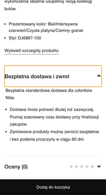
The user can make a purchase decision at any time while browsing the product card. It is also good practice to place price information in the middle of the button or near it. The main menu bar is unnecessary, the multitude of options increases the likelihood of leaving the product card, and we want the user to move through the purchase process towards completion. Not necessarily distracting their attention to other activities – like using the main menu when they have selected a product they are potentially interested in.
However, beware of floating elements in forms. Placing a floating ‘Next’ button when all the fields on a form are required to be filled in is not the best solution.
This leads to a situation in which the user sees an inactive button, taking up a large part of the screen:
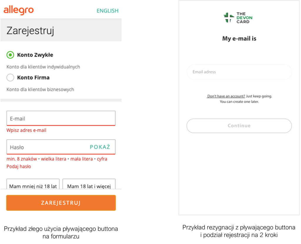
The example on the left shows the situation where the user clicks “Register” before entering the details into the form. Below the visible area on the screen shown, there are still the marketing consents required to register the account. However, the “Register” button can be clicked before the entire form is completed, which on devices with a small screen (such as the iPhone SE) causes consternation when an error alert pops up. The user may not realise that there are some fields they should be filling in below. All because the CTA button is stuck to the bottom of the screen and visible just after the page loads. The solution is to split the form into two steps so that all the information can be in the visible area without scrolling. Often we may ask for an email first. If the user provides an existing email in our database, we immediately ask them for their password. If the e-mail does not exist in the database, we go straight to the account registration process, which is also divided into steps. It will also help to blank the button when we have not filled in the required fields. On the other hand, if the forms are large and cannot be divided in a logical way, we should resign from the floating elements and place the button at the end of the form.
Overall focus on the purpose of a mobile application or solution
In the early stages of projects, it is often the case that clients are focused on maximising the number of available options and paths that a mobile application can offer to the end-user. However, RWD apps and websites that are more likely to be visited by smartphone users should focus on the objective. When we buy a truck, we shouldn’t expect it to replace a convertible in the summer, and a multi-coloured magic pencil shouldn’t replace the array of colours in a pencil case. The situation is similar with mobile applications – if we are focused on sales and this is what customers want from an application, there is no point in adding more functions, which are often part of “information noise” and misinformation. One client asked me to add the functionality of locating products in physical shops to an m-commerce shop. Discovering a path where a person who is in a physical shop, suddenly decides before finding a product on the shelf to find it in m-commerce and there click ‘locate product’ is difficult for the user. The very idea of providing such functionality to the user is right, but in this case, we should think about creating two applications – one supporting the online shopping process and the other supporting the offline shopping process, preferably within one SSO account (Single Sign-On – the user has one account to log in to all services). When developing projects for mobile devices, focus on the main goals of the application and study the popularity of additional options. If users do not use them, we can remove them with a clear conscience, simplifying and improving our product at the same time.
The impact of good design practices on the m-commerce market
If a user perceives the mobile experience as negative, the chance to make a purchase (including a subsequent purchase) drops by 62%. This fact clearly shows the importance of user experience and the impact of good design on the increase in conversions. The examples presented earlier show considerable reserves when it comes to the approach to RWD website design. In the coming months, with the rapid growth of the m-commerce market, brands will be increasingly concerned with optimising their presence on mobile devices. It seems that the three times higher conversion of in-app purchases is due to access to better-designed solutions. In the case of RWD sites, this is often simply a transfer of desktop solutions to a scaled-down mobile experience. In the context of m-commerce development, the “mobile-first” approach becomes even more important.